I decided to write the poem myself, in English:
"I am anxious
I am suffocating
I am gradually drowning in this wave of people
Which seems to constantly haunt me
Am I paranoid or am I really suffering?
I am trapped in the midst of thousands of individuals
Each one going in an opposite direction
And yet each one of them seems to follow my shadow,
Trapping it,
Keeping it steady, immobile,
Capturing, stealing
All its strength.
I can perceive a very strong sensation of
Claustrophobia and enochlophobia.
I need to breathe
I need to able to yell at the world
That I need to be released
I deserve the right to gaze at the dawn
Over, on the other side of the city
I need a serene moment of interior peace
Where I am able to perceive a gentle breeze
Which blows and with deliberate silence,
Strokes my hair."
I was thinking that this could be the background of this project.
Monday, 26 October 2009
EnochlophobiA
In this new project I am exploring one of the many phobias of human beings: enochlophobia. Enochlophobia is the fear of crowds, of being surrounded by large groups of people, generating feelings of insecurity, anxiety, and in a way, 'suffocation' as well. Since my main theme is that of 'FEAR', I wanted to convey this 'phobia' not only by painting many figures from several different pictures I took this summer in Amsterdam, but as a background, I wanted to repeat that idea of enochlophobia through words. Basically, I wanted to find a song or a poem about it and translate it in Dutch and use it as a background, almost as if the words became 'haunting' and causing anxiety just as crowds do.


Friday, 11 September 2009
interesting page on deviantart

OH MY GOSH!!!!
so I was looking at some pages of artists on deviantart.com and opened a link to photography of people...and it was amazing! the artist seems to be inspired by darkness, loneliness, dark colours and japanese models.
so below is the link:
Saturday, 29 August 2009
Drawing in acryllics, black pen and string
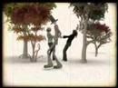
I have started about a month ago a drawing for my own choice as I am planning to apply to art college, so I have been continuing it and even if I still ahve a lot of work to do, I am satisfied with how it is proceding. The drawing is based on a man in front of the Centre Pompidou who was performing a small puppet show to earn some money and I found the scene interesting so I took a picture of it and started drawing. The drawing is in black biro pen, ocre, yellow, brown, white and black acryllic paint and 5 pieces of string. Below is the actual picture and the way the drawing is proceeding:


Friday, 31 July 2009
SUMMER HOMEWORK
As part as the summer homework, I was also told to do some drawings from reality...and I am working on a portrait in biro pen of my sister, on rough paper... could I also do drawings on the architecture of a building or other interesting scenes, and not just the human figure? And since I am very confused of what to do for the EE as you may have noticed, I was probably thinking that the easiest thing was to compare to paintings or two artistic currents (for example, since I will be going in mid august in the Rijksmuseum in Amsterdam, I could as well compare Flemish paintings of the 1600's_for examples Johannes Vermeer_ with Italian paintings of the same period)
Monday, 13 July 2009
I just had an amazing idea better than all the others. 4 years ago I visited Slovenia and Croatia during my summer vacations and with my family, we also visited the city of Dubrovnik, famous Croatian port, destroyed in 1991 due to the war in Kossovo to conquer independence. Now people are reconstructing the historic centre of the city, and trying to protect what's left from the damage. Therefore, a title could be ' Protection of artistic heritages after war situations'.
EE- continued
Unfortunately I am unable to go to Athens since my friend living there is spending her holidays in another country, therefore, I was thinking I could probably visit the Galleria degli Uffizi in Florence and the Basilica di San Francesco alla Rocca in Viterbo. Otherwise, I will try to come up with other ideas. What really attracts me is Impressionism, it would've also been interesting to compare it with another artistic current by actually visiting art museums and art galleries.
Sunday, 7 June 2009
Youth
Youth. One of the two main themes I will be exploring this summer for my new project. Below, is a picture I took from my IWB of the face of a baby (awwwwwww) and a young teenager listening to music:


Sunday, 31 May 2009
Theme for Summer Proj. and 7 Calendar Months
I was looking at some old pictures on my computer of me when I was a child and of my grandparents...and suddenly I thought that, it would have been an interesting theme to investigate and explore the boundaries between youth and senility, therefore, I produced some brainstorming and some drawings to compare an old man and the many wrinkles covering his face, with a young woman and her soft, bright skin. I found the theme quite interesting because it allows me to explore further and I have a clear overview of how creating new ideas for a project relating to this theme.

Monday, 18 May 2009
ee again
My sister was telling me the other day about her trip to Pompei with her class and was talking about the paintings on the walls which still remain today, and so I had a new idea for an EE: visiting archaeological sites and old churches, to investigate and discover how the deterioration of paintings may affect the perception one has of the work of art. By doing this kind of research, I must visit different places and write many notes, therefore, I thought it could have been a good idea for an EE. Today, after lunch, we have a double session on working on our EE and therefore I should start writing and researching about an idea already.
Friday, 15 May 2009
EE Themes
I had already written a post about 1 month ago on themes that could be interesting for an EE in art, but unfortunately I found them to be a bit difficult to develop further. So, today, I was thinking of other interesting ideas for an EE, and they were the following:
1. The evolution of fashion designing from the 1900s to the 21st century- this particularly interests me seeing that I would like to specialize in fashion when I am older, and is a topic which could be written a lot about and something which has always fascinated me, since I started art high school two years ago.
2. Patterns and shapes of Indonesian textiles and fabrics- textiles are different from culture to culture, and are characterized by different use of colours, different shapes and patterns and is something which may be developped further, also because I have always been interested in Indonesian art, culture and traditions.
3. The use of the Batìk technique in different countries of the world- recently I have began to use Batìk and I have researched on books and on the web to discover artists specialized with the use of this art technique, and now I am really curious in discovering if there are significant differences in the use of Batìk in different countries.
Tuesday, 12 May 2009
Theme of Crowds


I went in Bracciano today with my Geography class and I took a couple of random pictures which then I modified and which turned out to be very interesting...I could use them for my next project, maybe..
Thursday, 9 April 2009
WoRdS aNd PaRiS
I was thinking of,
linking all the art I will see in Paris this week
(yey I can't wait!!!),
with death or one of the 5 senses
(probably touch or sight).
I will go to the Père Lachaise cemetery,
the Louvre,
the Musée D'Orsay,
Musée Rodin,
Centre Pompidou,
but also in some very unusual streets,
such as the Rue Mazarine where there is this creepy face
sticking out of a wall
next to the window of a house.
XD
but I am still thinking about it...
its not a definite idea,
just an
idea.
ART EE IDEAS
I had three ideas for an extended essay, although I couldn't discuss them earlier:
1)the first one, would be to interview two artists who I recently discovered searching on the net, who are Mark Halsey (England), an artist who concentrates on abstract effects, as well as dynamism and patterns:
http://www.markhalsey.com/gallery/gallery.html
and Paul Wright (England), an artist who studies the structure of the human visage and environment by using very powerful and striking colours:
http://www.modernartistsgallery.com/artistdetails/73_PaulWright.php
2)I am going to Paris and thought that maybe I could compare Impressionism with Post-Impressionism (my favourite art styles)
3)Link art with special effects used in movies (although in this case, I must research further because it's an idea which popped in my mind just now)
Wednesday, 1 April 2009
.ChErNiCk & LiJuN.
For this month, I focused on two artists, whose works have interested me a lot. The first one, is Saul Chernick, an artist whose works display unusual images of landscapes, skeletons, human beings and animals, and many of them, such as The Predator's Waltz (http://www.maxprotetch.com/main.html?id=231&show=4) are quite terrifying and disturbing. His works are all only in black and white (probably ink?) , but some of them have backgrounds of very light, smooth colours, creating a sort of unifying link with the black outlines of the drawings.

The second one, is Fang Lijun, an artist whose works mainly display bald, egg-headed, 40-50 year-old men, babies and human figures with backgrounds of skies and infinite fields. In most of his paintings, humans lose all their seriousness and they convey to the viewer, a sense of irony, joy and humour, displayed in a very original and unusual way. His paintings contain very bright colours (light blue, red and orange especially) but also very misty and sad colours, creating a significant contrast with the joyful men.


The second one, is Fang Lijun, an artist whose works mainly display bald, egg-headed, 40-50 year-old men, babies and human figures with backgrounds of skies and infinite fields. In most of his paintings, humans lose all their seriousness and they convey to the viewer, a sense of irony, joy and humour, displayed in a very original and unusual way. His paintings contain very bright colours (light blue, red and orange especially) but also very misty and sad colours, creating a significant contrast with the joyful men.


Le Squelette d'une Main
'Le Squelette d'une Main"- The skeleton of a hand
So, after a short-term period in which my obsession was De Chirico's works, a new one has arose. I am fascinated by the anatomy, all the details of the human body, and particularly, the skeleton of the human being. It is evident that the 2 new projects are both based on the skeleton of the hand, but I tried to modify it's usual appearance on Google.images or anatomy/biology textbooks. By doing these 2 projects, I tried to enhance its structure, to develop a sense of power and terror, but also to display it in different and unusual ways: the painting of the movements and positions of the hands I decided to do with acryllic skin or muscle-related colours, such as red, brown, pink, also to confuse the viewer's 'view', as well as to demonstrate that each thing, each object can be seen in variuous ways, in different perspectives. The small-sculpture of the hand, I decided to paint with yellow and white-chocolate colours, especially because I would like to create significant contrast between the dark colour of the quilt and the bright colour of the hand. To do the sculpture, I first of all drew an outline of the hand and had it cut out for me. Then, I started to work on the complex bony structure of the hand with clay, which then I covered in modroc, as I did with my previous sculpture of the anorexic woman. I painted it in white and then decided to enhance the darker parts by using light and normal primary acryllic yellow. Below, are some pictures which show the way the sculpture of the hand has developped since the day I began it, which was approximately 1-2 days ago:
1.

2.

3.

Monday, 30 March 2009
Working on my project
Currently, I am working on 2 projects, one of which, I decided to do by my own choice. The first project, is a painting, made on hard w
hite paper, which consists of the skeletal structure of hands in different positions, with a relatively wide range of media, to enhance and give more structure and dynamism to the painting itself, such as tissue paper, almost entirely covered by bleach, black indian ink to make the outline of the hands, and acryllic colours of very unusual colours:

The second and most important project, consists of the sculpture of the skeletal structure of a hand coming out of a quilt or some sort of similat fabric, on which, circular shapes would be drawn so to represent a very peculiar gate I saw between Via del Corso and Via Nazionale, which was characterised by an excessively rich quantity of geometrical shapes and lines. My intention is to draw those circular shapes using Batìk, on white cotton, and then dye it in a dark colour (such as dark blue or dark purple), so as to create a contrast with the pale white of the skeleton. Below, some pictures of the development of my two projects and how they are gradually evolving:


Thursday, 19 March 2009
L'Image et L'écriture- Raymond Poulet


A couple of days ago, I was re-reading a french magazine of art I bought during Christmas holidays, called "Univers des Arts"and discouvered many unknown artists, and the one who struck me the most was Raymond Poulet. His paintings are inspired by Oriental art and contain a wide range of colours, as well as geometric lines and shapes, dynamism and words ("L'image et L'écriture" in fact means "the image and the writing").
For example, an amazing painting known as "Un jour de plus" contains a short text written in vietnamese:
"Each morning, when I wake up, I thank life, for giving me, another day in which to love"
Here's the link to his official website if you want to discover and learn about his other paintings, as well as sculptures:
http://www.raymond-poulet.com/
Power and Pattern: my two chosen words
Here are some pictures I took of the interesting pages did so far on my workbook which relate to the 2 new projects I am working on: the first, is the skeletal structure of a hand coming out from a quilt with circular patterns drawn on it ( to represent the patterns of a gate located between the Colosseum and Via del Corso) and the second, is a painting of the anatomy of the skeletal structure of a hand in different positions. The other drawings and sketches are just different ideas for a final project. The materials I used to create these skecthes were the following:
-charcoal
- black indian ink and bambu sticks (of different sizes)
-Photoshop
-highlighter
-dark blue pen
-tissue paper
-coloured ink
-acryllic paint
-bleach


-charcoal
- black indian ink and bambu sticks (of different sizes)
-Photoshop
-highlighter
-dark blue pen
-tissue paper
-coloured ink
-acryllic paint
-bleach


Saturday, 21 February 2009
Pics from Rome
"Rome is but nature's twin, which has reflected Rome
We see its civic might, the signs of its decorum
In the transparent air, the firmament's blue dome,
The colonnades of groves and in the meadow's forum."
- Rome, Osip Mandelstam
Here are some pictures I took when I went to Rome in these last weeks:
-The second and third pictures, I took the day the "Futurama" exhbition in Rome was inaugurated, and the effect of the strikes of light and the "movement" effect of the camera, make the pictures even more interesting
- Most of the other pictures show some typical 'views' of Rome, although I decided to take the pictures with different effects (black and white, negative effect and seppia)


Subscribe to:
Comments (Atom)